TashWord
Tash is a professional writer who loves helping people communicate clearly and effectively.

Aside from the need to capitalise certain letters, changing the case of words can be used for emphasis and differentiating headings. However, within a document, all headings should use the same case style.
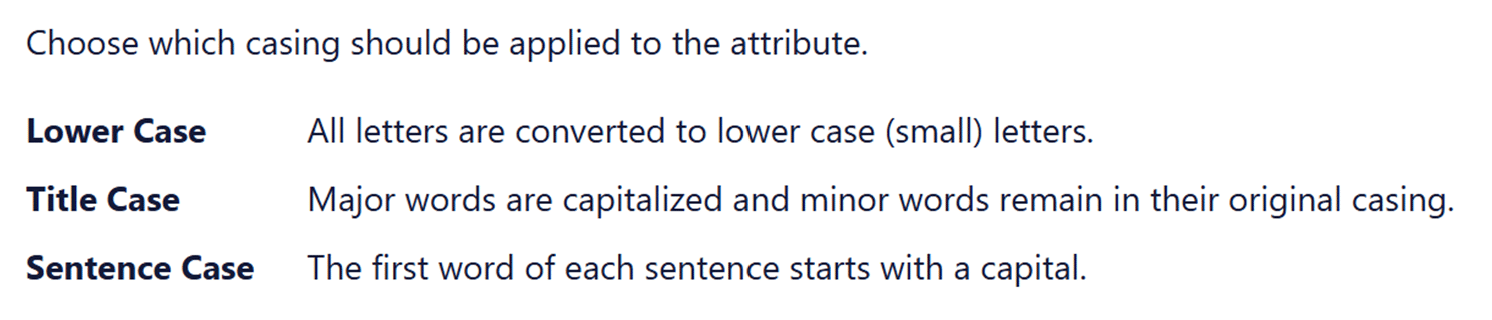
Case for a letter simply refers to whether it is a capital or upper case letter (ABC) or lower case letter (abc).
When using headings in documents, it is usual to make the headings a bit different to the general text. One way of doing this is to adjust the capitalisation of words in the heading.
Let’s start by saying that using all capital letters (upper case) in a heading is not recommended. It is harder to read and can be interpretated as shouting or yelling at your reader.
The opposite is to use all lower case letters. This is simple and very effective if used as part of a brand style. However, it does miss basic grammar and gets trickier if your heading includes a word that needs a capital. For instance, would that style use “catching a melbourne tram” or “catching a Melbourne tram”?
There is a traditional option called Title Case. For this, every key or functional word in a heading starts with a capital letter which helps make the heading stand out and have a little more weight than the general text. Words like of, and, or and for usually are in lower case for this style. Personally, I don’t think this adds enough value to warrant typing all those capital letters! And I do not like title case for content underneath headings – it is distracting.
So that pretty much leaves us with sentence case for headings. Sentence case is as you’d expect – only using a capital letter at the start of the sentence and for proper nouns. This is easy to write and read. It is also easy to remember as your style – I have seen documents where headings vary cases because the style is forgotten in the course of writing the document.
There are other case styles but they are not used as heading styles.
It is distracting and looks unprofessional to use different case styles in headings (and content) of a document or website. Using the same base style gives a consistent look and allows the content to shine rather than the formatting.
Look at the options – lower case, title case and sentence case – and decide which one suits you and your business or document. Then make that a rule. That rule needs to be added to your style guide – or used as the start of a style guide if you don’t have one.
If need be, adjust the heading settings in your software so H1 and H2 will always present the same way without any additional effort from you.
Recently, I was adjusting some settings and was given the choice of case style in headings.
In this case, the three styles presented consistently, as did the descriptive text of the styles. Yet it felt wrong as the words and content were clashing – lower case and Sentence case were written in Title Case. This is one time where changing case of the options would have helped illustrate the differences. Would you prefer the consistency here or the visual aid of explaining the options?
However, this example also lacked clarity in the definition of title case.
Letter type cases or case styles refer to how letters are presented, either as upper case (capital letters) or lower case. It is important for making things easy to read.
Originally, writing was all done in upper case or capital letters. The creation of a duplicate alphabet of lower case letters in the Middle Ages made writing faster. In 1439, the introduction of the printing press made the two cases more distinct. Printers had a metal block for each letter that they combined for actually printing. What we know as lower case letters were used more so were kept on the more accessible lower shelf. Capital letters were kept on the upper shelf. Thus, letters became known as upper and lower case.
Only capital letters are used. FOR EXAMPLE, THIS SENTENCE IS TYPED IN UPPER CASE.
This is harder to read and is considered to be yelling in modern communications. I strongly recommend this is not used in business communications.
Only lower case letters are used. this sentence is in lower case only, not even a capital to start the sentence.
While easier to read than upper case, it is harder for the reader to see the gaps between sentences so ideas blur a little. It can appear ignorant or lazy to not include capitals appropriately.
All important or functional words start with a capital letter. Here is an Example of a Sentence Written in Title Case – Although Some People Capitalise Every Word Not Just Functional Or Major Words.
My main concern with this is how long it takes to capitalise those functional words! I also find that it looks pretentious and provides no real value.
Sentence case is what we are used to seeing in books, newspapers, websites, magazines, and apps. Most sentences in this blog post are written in lower case letters, with capital letters just for proper nouns like Tash and the first word.
If you aim to use this, even if you occasionally get capital letter rules wrong, most people will find it easy to read and focus on the content rather than the writing and type case.
With the evolution of content away from purely printed word, some other case styles have developed their own style rules. These cases are only used for specific purposes, rather than in general content, and become more specific for coding and programming.
This type case evolved predominantly for nouns and product names where there is a mix of lower and uppercase within a word. It is generally a merging of words, losing the space between them but keeping the capital letters. So MasterCard, PlayStation, OneDrive, and even NaCl (Sodium Chloride or what we know as table salt) are all camel case.
It further developed into upper camel case or Pascal case where every included word starts with a capital letter and lower camel case. In lower camel case (or dromedary case), a lower case letter attached to the start of a word. Common examples are eBook, iPad, eBay and even lowerCamelCase.
This is for website addresses and is not used in general text. Kebab case is written in all lower letters and includes hyphens and slashes. For example, /starting-your-style-guide and /blog/category/monday-meanings/.
Not used in general text, snake case is used for naming files. This type case helps identify where a file is kept. Snake case is always in lower case with words connected by underscores. Examples include ‘website_content_review’, ‘annual_report_outline’, and ‘blog_review_schedule’.
Unfortunately, I had to make a complaint against a bank. In doing so, I spotted this incomplete introductory text on their website.
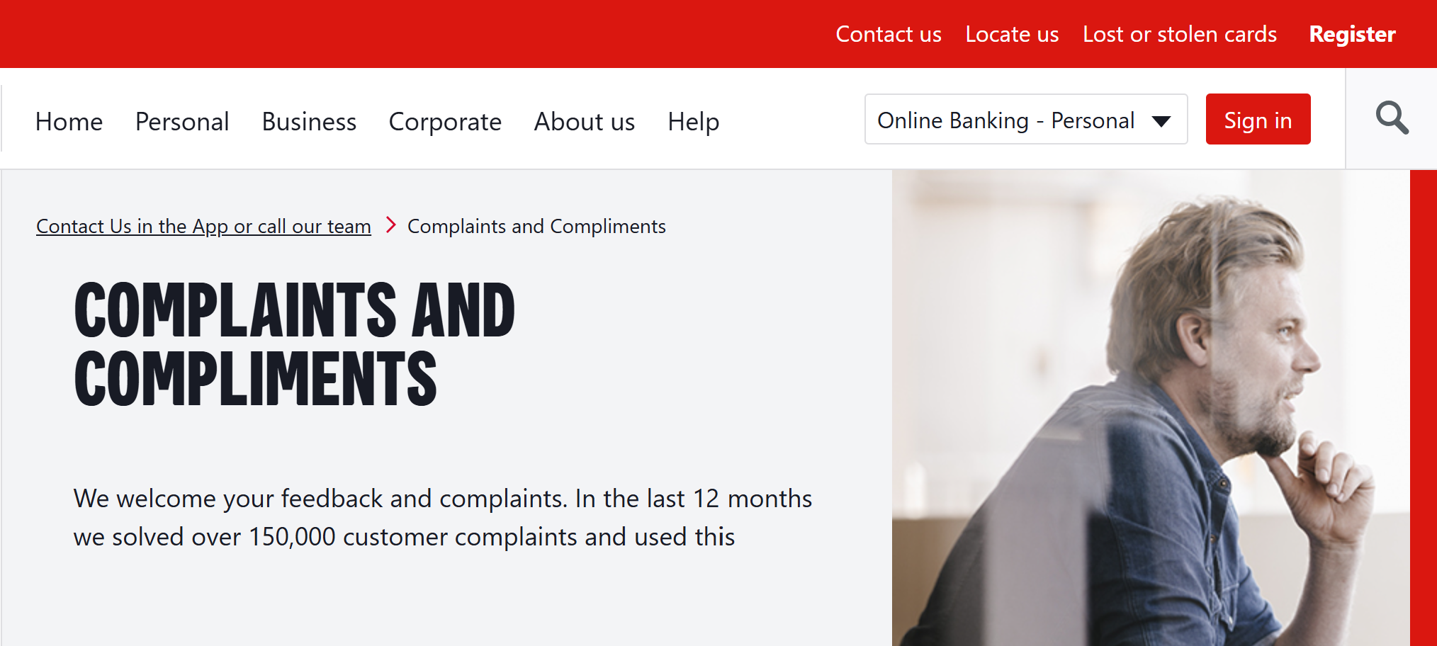
An incomplete complaints introduction on a bank website
The sentence “In the last 12 months we solved over 150,000 customer complaints and used this” is obviously incomplete. What do they use these complaints for?
I amused myself with potential endings for that sentence…
However, I assume what they were trying to say was along the lines of ‘we used those complaints to improve our services to customers’. I wonder what other endings people have devised for that sentence, given they are probably already annoyed by the time they reach the complaints page…
If they actually think it is a complete sentence and idea, it is still poor to not add punctuation at the end!
How does your business use complaints and other feedback received?
Telling me they had so many complaints and leaving the sentence unfinished is certainly not inspiring any confidence in them or their services! It may seem like a simple error, but it can seriously damage your reputation and cost you business.
This is why it is always good practice to reread and proofread things before you publish them. Preferably a day or so after you wrote it as mistakes can be easier to spot later on. And having someone else read your words is an even better safety net.
And then the published page needs to be reviewed. Maybe this text was complete in draft form and something got deleted or hidden in the process of publishing it. If you have read and checked something multiple times, it is easy to skim read and assume all is ok. However, the final version must be checked thoroughly to avoid mistakes like Westpac.
In a big business, I would expect a process so mistakes like this are avoided. For smaller businesses, giving yourself time for checking whenever possible is a safer option.
It’s winter and many of us are in some form of lock down so what better time to catch up on some reading! 
I have just placed an order for some books with Book Depository and discovered they are running a read-a-thon. So in case it inspires you to read, or gives you some motivation to try some different books, I thought I’d share the idea here.
Basically, they are giving some ‘rules’ to guide your reading between 23 and 30 August:
Which rule will you chose for the read-a-thon for winter? I’d love to hear what books you read and what you think of those books, too.

Ahh the irony of people giving advice without the skills!

Good writing won’t leave your audience confused
Helping my daughter, I came across an article giving tips on how to write an ‘extraordinary’ speech for school, but much of it does not make sense. I’m really not sure how a student is meant to improve their speech writing via this article.
Examples like this show the value in having someone else reading your work to ensure it makes sense and meets basic grammar rules. The more skilled the person checking it, the better feedback you will obviously get, but even a less skilled person could point out any confusions.
So lets look at parts of that article and see how it could have been less confusing…
Article text: …appreciated by your teachers, individual understudies…
My comment: do student usually have understudies listening to a speech? I assume they mean ‘fellow students’ or simply ‘classmates’.
Article text: …write the same data in each of the paragraphs that are the relief of this subheading.
My comment: Apart from being boring to read if they actually use the same data in every paragraph, I think the article writer needs to learn that relief means to ease or alleviate stress, pain, discomfort and so on. It is unlikely that a subheading feels anything that needs relieving – although I felt relief to stop reading this article!
Article text: If your subheadings and speech are moving farewell then they can make the Audience bored, otherwise, your speech will be very good.
My comment: I don’t know what this sentence is meant to say! “If your content is moving forward” is what I first thought it should be, but that doesn’t work with making the audience bored. Maybe farewell should be replaced with slowly?
A much smaller issue is the capital A for audience as it is totally unnecessary and visually stood out to me as wrong.
Article text: The first lines … are to speak at certain points so that … everyone becomes insensitive and attracts all the speech. Your first lines are the first impression on your audience.
Comment: This implies that the aim of a school speech is to make people insensitive which is a pretty strange aim – again, a use of vocabulary that is not understood causes big problems in writing. If you aren’t sure of a word, use one you do know – big words are not impressive if used poorly.
As for “attracts all the speech”, I think this means “engages the audience quickly so they listen to all the speech”.
Article text: Between the teachers day speech looking at the Audience is not to be disturbed and you have to control your emotions and to point with your hands so that Audiences are attracted and keep their voice down and down.
Comment so it makes sense: oh my goodness, where do I start with this paragraph?
Well, the above hopefully gave you a giggle at some poorly worded tips! And hopefully reminded you of the importance to checking that your work makes sense and reads as you intend.
The key lessons from this article are
What is the point of promoting something without explaining how to get it?
Due to my connection with Love Santa, I keep an eye on Christmas news around the world. Recently, I went to a site to read about some Christmas movies coming up – it mentioned things like Home Alone and How the Grinch Stole Christmas (one of which is debated to its place as a Christmas movie every year!) This is a news type site with a section on entertainment – it was Australian but I hadn’t been there before.
What struck me though was the lack of basic and critical details. Paraphrasing, the article said “SuperChannel {made up name!} is starting some Christmas movies in November and here’s their full schedule”‘ then listed all the movies for November.
The article had some links to other pages on the site about types of movies and so on, but no link to SuperChannel.
Personally, I have never heard of SuperChannel so I’m pretty confident it’s not a free to air TV channel. So how do I see movies they play? It is within a subscription to an on-demand service? Or maybe its an online channel of some sort?
When writing, for pleasure as well as business really, make sure you give necessary information rather than assume people know it. Even when you know the audience well, be careful to not miss important details.
From the article I mentioned above, I can now tell you when Home Alone will be showing. I have no idea how to find it and watch it, so knowing the timetable is fairly useless. Maybe the writer or site assumes ‘our site members knows SuperChannel’ but what about new members or people coming across the article (as I did) for the first time? What about the members who know the name but can’t recall access details?
Even if your audience does know the basics, where/how to access something you are promoting is critical information to include.
“I use to get jewelry and a print or something they made . It was a nice jester.”
This is a comment I spotted on social media recently in response to a request for some gift ideas. It took me a moment to realise that ‘jester’ was meant to be ‘gesture’, but then it all made sense.
I must admit this is not a pair of words I had thought of as spelling options before, but I now know they can be confused so here are the meanings…
jester [noun]: a person who entertains, especially in medieval times, and often does so through silly behaviours. Also known as a fool, a jester often wears a funny hat with bells hanging from it.
The King laughed as he watched the jester before dinner.
gesture [noun]: a movements of limbs, head or body to express an emotion or thought.
A nod of the head is a gesture of approval.
The key thing I can see that may help you know which word to use is the relationship between jest (to joke or laugh) and jester.
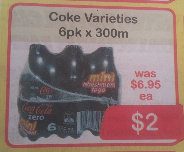
While there is an expression about having a long drink, length is not usually a measure of drinks. So I was surprised to see an ad for 300m of a soft drink in some recent junk mail!
As always, the message is that proof reading is really important. And it is best done by someone else or at a later time as proofing as you write has limitations.
Of course, the person preparing the ad may have written 300ml but something happened at the design or printing stages – but that is why printing proofs also need to be checked carefully.
Do you know what a closed question is?
I’m sure I didn’t learn about open and closed questions until much later, but my children are learning this in primary school. This is a good thing as it can help them communicate socially as well as within their school work.
Closed questions – elicits a simple response. For example, the question “do you like blue or green?” can be answered with one word.
Open (or open ended) questions – give scope for more detailed and complex responses. Open questions such as “why is blue your favourite colour?” or “what do you like about that book?” require longer answers and can lead to a discussion.
Have you ever heard questions referred to as thin and thick questions rather than open and closed?
The first time I knew of the thin/thick nomenclature was when I saw some work my daughter did at school. I know enough about open/closed questions to figure out what was meant by thin and thick so I interpreted the schoolwork very quickly. And I assumed the children had been taught thin/thick instead of open/closed.
Then I read the schoolwork in more detail.
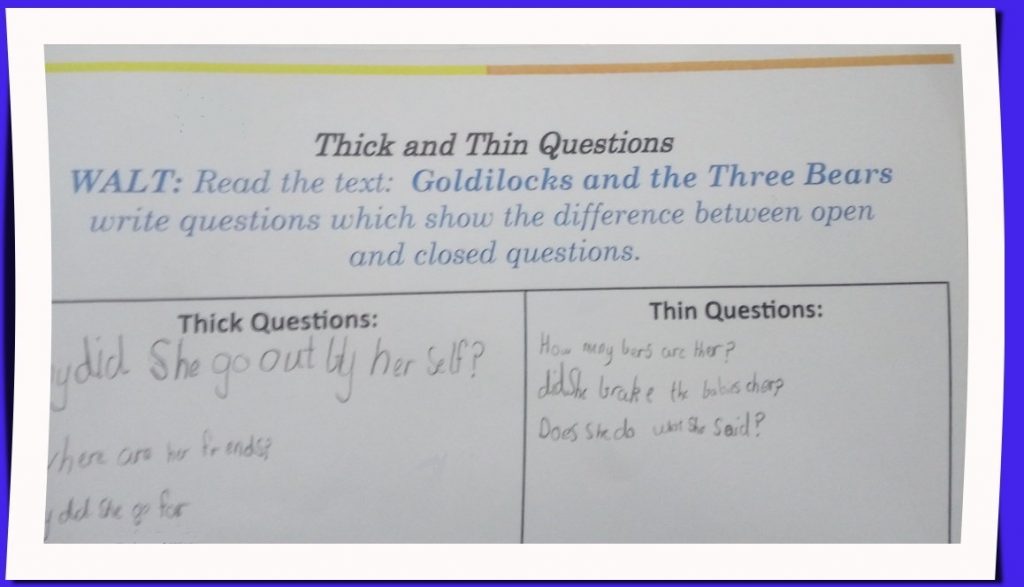
The instructions swap between thick/thin and open/closed questions without any explanation that they are the same concept (and not even in the same order which makes it even harder to correlate the pairs of words). Given that this activity is obviously aimed at teaching children about open/closed questions, surely it would be better to use the same terminology for the one activity.
It’s one thing for me as a professional writer to read these instructions and follow them easily. It’s something else entirely for a seven year old who is grappling with what these terms mean and finding examples of each type!
And my daughter said they were only taught about open/closed questions – she figured it out (and I think she did a good job devising relevant questions in the activity). I’m sure many of her classmates would have struggled if they were left to do this activity just by reading the instructions.
If you start using one term (or set of terms) when writing, then continue using that term throughout.
Even if you explain there are alternatives, stick to one term in your content. For instance, if you are writing about saving money, you may write something like
Contributing to your savings can be done more or less frequently. Contributions, also known as deposits or account credits, will attract interest and thus increase your savings over time. When deciding how much to contribute, you may consider your income, expenses and lifestyle choices.
You may not be writing for children, and your audience may easily figure out your message, but why make it harder to read than necessary? Why risk them not understanding and/or disengaging in your content?
Being consistent makes your writing easier to read and understand, looks more professional and will probably help search engines recognise a keyword in your online writing.


Recent Comments