I hope you find my writing and business tips and observations useful. My business and blog are dedicated to helping businesses communicate clearly and reach their potential.
Read, and enjoy!Tash

Choosing a case style for headings
Aside from the need to capitalise certain letters, changing the case of words can be used for emphasis and differentiating headings. However, within a document, all headings should use the same case style.
Case for a letter simply refers to whether it is a capital or upper case letter (ABC) or lower case letter (abc).
Case style options in headings
When using headings in documents, it is usual to make the headings a bit different to the general text. One way of doing this is to adjust the capitalisation of words in the heading.
Let’s start by saying that using all capital letters (upper case) in a heading is not recommended. It is harder to read and can be interpretated as shouting or yelling at your reader.
The opposite is to use all lower case letters. This is simple and very effective if used as part of a brand style. However, it does miss basic grammar and gets trickier if your heading includes a word that needs a capital. For instance, would that style use “catching a melbourne tram” or “catching a Melbourne tram”?
There is a traditional option called Title Case. For this, every key or functional word in a heading starts with a capital letter which helps make the heading stand out and have a little more weight than the general text. Words like of, and, or and for usually are in lower case for this style. Personally, I don’t think this adds enough value to warrant typing all those capital letters! And I do not like title case for content underneath headings – it is distracting.
So that pretty much leaves us with sentence case for headings. Sentence case is as you’d expect – only using a capital letter at the start of the sentence and for proper nouns. This is easy to write and read. It is also easy to remember as your style – I have seen documents where headings vary cases because the style is forgotten in the course of writing the document.
There are other case styles but they are not used as heading styles.
Consistency looks much better
It is distracting and looks unprofessional to use different case styles in headings (and content) of a document or website. Using the same base style gives a consistent look and allows the content to shine rather than the formatting.
Look at the options – lower case, title case and sentence case – and decide which one suits you and your business or document. Then make that a rule. That rule needs to be added to your style guide – or used as the start of a style guide if you don’t have one.
If need be, adjust the heading settings in your software so H1 and H2 will always present the same way without any additional effort from you.
Heading style vs heading content
Recently, I was adjusting some settings and was given the choice of case style in headings.
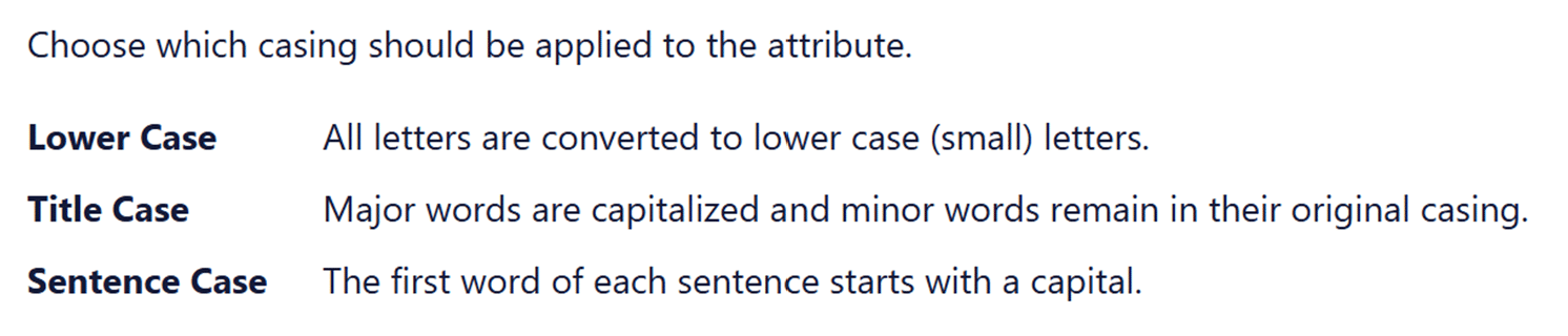
In this case, the three styles presented consistently, as did the descriptive text of the styles. Yet it felt wrong as the words and content were clashing – lower case and Sentence case were written in Title Case. This is one time where changing case of the options would have helped illustrate the differences. Would you prefer the consistency here or the visual aid of explaining the options?
However, this example also lacked clarity in the definition of title case.
- what is a major word and what is a minor word?
- ‘remain in their original casing’ could lead to a mess. Imagine I type or paste in some headings in upper case and some in lower case – does that mean some minor words will keep that format? I would trust the process better if it stated ‘minor words are in lower case’.
Understanding type cases
Letter type cases or case styles refer to how letters are presented, either as upper case (capital letters) or lower case. It is important for making things easy to read.
Traditional type cases

Originally, writing was all done in upper case or capital letters. The creation of a duplicate alphabet of lower case letters in the Middle Ages made writing faster. In 1439, the introduction of the printing press made the two cases more distinct. Printers had a metal block for each letter that they combined for actually printing. What we know as lower case letters were used more so were kept on the more accessible lower shelf. Capital letters were kept on the upper shelf. Thus, letters became known as upper and lower case.
Upper case
Only capital letters are used. FOR EXAMPLE, THIS SENTENCE IS TYPED IN UPPER CASE.
This is harder to read and is considered to be yelling in modern communications. I strongly recommend this is not used in business communications.
Lower case
Only lower case letters are used. this sentence is in lower case only, not even a capital to start the sentence.
While easier to read than upper case, it is harder for the reader to see the gaps between sentences so ideas blur a little. It can appear ignorant or lazy to not include capitals appropriately.
Title case
All important or functional words start with a capital letter. Here is an Example of a Sentence Written in Title Case – Although Some People Capitalise Every Word Not Just Functional Or Major Words.
My main concern with this is how long it takes to capitalise those functional words! I also find that it looks pretentious and provides no real value.
Sentence case
Sentence case is what we are used to seeing in books, newspapers, websites, magazines, and apps. Most sentences in this blog post are written in lower case letters, with capital letters just for proper nouns like Tash and the first word.
If you aim to use this, even if you occasionally get capital letter rules wrong, most people will find it easy to read and focus on the content rather than the writing and type case.
Modern type cases
With the evolution of content away from purely printed word, some other case styles have developed their own style rules. These cases are only used for specific purposes, rather than in general content, and become more specific for coding and programming.
Camel case
This type case evolved predominantly for nouns and product names where there is a mix of lower and uppercase within a word. It is generally a merging of words, losing the space between them but keeping the capital letters. So MasterCard, PlayStation, OneDrive, and even NaCl (Sodium Chloride or what we know as table salt) are all camel case.
It further developed into upper camel case or Pascal case where every included word starts with a capital letter and lower camel case. In lower camel case (or dromedary case), a lower case letter attached to the start of a word. Common examples are eBook, iPad, eBay and even lowerCamelCase.
Kebab case
This is for website addresses and is not used in general text. Kebab case is written in all lower letters and includes hyphens and slashes. For example, /starting-your-style-guide and /blog/category/monday-meanings/.
Snake case
Not used in general text, snake case is used for naming files. This type case helps identify where a file is kept. Snake case is always in lower case with words connected by underscores. Examples include ‘website_content_review’, ‘annual_report_outline’, and ‘blog_review_schedule’.
Recent Comments